Sunday 11 September 2016

FINAL DAY- Vis Com. The end YAY!

This is a visual evolution guideline through phases of ideas and design for my logo Digital Mountain.
I started with a inspiration and moved from there using mainly Adobe Illustrator to work up my concepts.

 The original inspiration found online


 An early mock up.


 Playing with cloud across the mountain top. Then (below) moved to a simpler visual design. But admittedly I was never fully happy with what I was coming up with. Some of my frustration stemmed from inability using Illustrator.


 This new design came from a newly found inspiration (above) I liked the use of the negative space and the positive space. I decided to change direction and keep some of the aspects of my previous designs, ie: the triangles inspired by the mountain.

 And here is the final logo design as it stands today. The colors have been applied as a gradient across the logo. I found this more pleasing to the eye. I am aware of the muddied colors in the middle between the yellow and the green but it doesn't bother me. Its part of the gradient color  cycle through the rainbow of aesthetic.


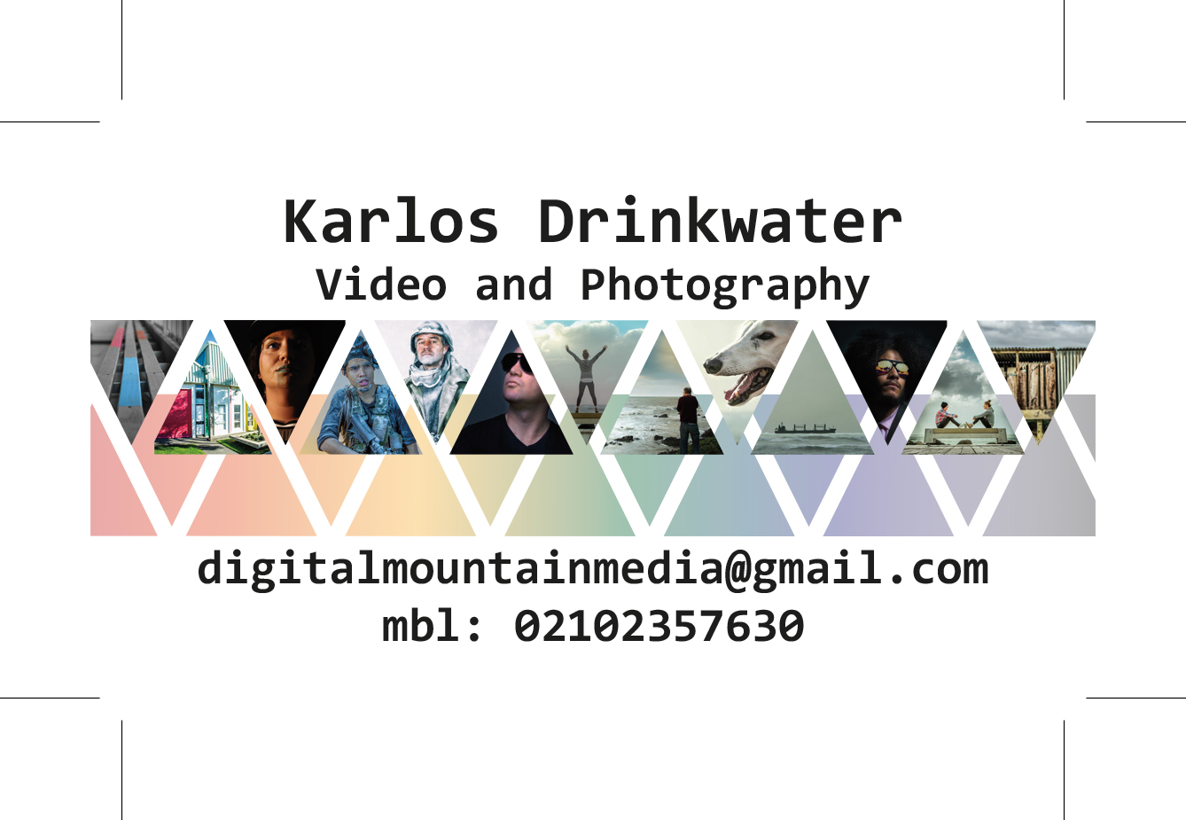
And finally here it is on front of the business card...


The End

Day "I've lost count" Vis Com continues again...

Okay my logo has gone through changes and the design concept is really representing the ideas I wanted it to. Important to me is the Taranaki Mountain, that is the foremost idea I want to convey. So in the positive space I will show the Mountain and ranges and in the negative space is the D and M of Digital Mountain. I have gone with a colorful spectrum in the design because I really like it. It reminds me of a test print on a printer for color balance and has a real connection for me with digital printing, at least it conveys that feeling through to me.


Here it is ion the black version for light colored areas on photos.


Here are what I call my color bars. They are for use with letter head and business cards. And at the bottom is my photo bar. All to be used in conjunction with each other.


Day "Who Knows"- Vis Com Continues

A new inspiration found...

I love this logo found of Pintrest, The positive and the negative space is what I like the most and the fact that it represents the mountain in its positive space. This is my new inspiration and I have decided to continue with my design inspired by this visual concept.


A little while later...
Here is the concept put together with triangle divisions throughout the frame of the positive space. I feel this is still too close to the original logo but I will keep making changes and experimenting with the form of the logo and color treatment. 


Sunday 14 August 2016

DAY FOUR- Vis com. Logo sketches and concepts.

Okay. The brand is Digital Mountain. Videography and photography. The service statement for my business is-

"Digital Mountain provides promotional video and photography creating brand and product visibility for our clients"

I want my logo to say: Taranaki and proud, Geographical location. Digital expertise, Cultural awareness, and a natural effinety with the land. I am attempting to achieve this through the imagery. The mountain, the regional color scheme, the flax (which also doubles as a type of digital transformation at the top of the mountain)


Now to bring this sketch into Adobe Illustrator and turn it into a vector image. Rock on.

Sunday 31 July 2016

DAY TWO- Vis Comm: Brainstorming and exploring logo ideas.

 Here I am brainstorming concepts about my Branding Identity. Asking questions in areas like: What is my sector?, What kind of Photographer? Videographer am I? Who do I want my aesthetic to appeal to? etc...

A couple of my brain storms...


Design Concept: ABSTRACTION.

Here is my current logo. I have designed this recently. I would like to use this paper to build on it and develop the concepts in this design further...


Here are a bunch of other LOGOS that have some similar concepts that I like, or are representative of the same region that I want to represent in my design concept.


Sunday 24 July 2016

DAY ONE- Visual Communications (VIS-COMM)

Project one:

Identity Design.

There is a lot to think about here.
Projects are-
+ Designing and making a logo.
+ Business cards
+ Letter head
+ Watermark
+ Brand Manual
+ Web Site (choose one)

A lot of questions to think about along the way.
Here are the white board notes from day one. There are are lot of thought provoking questions and answers to be explored.


Moving on from here. There is a lot for me to think about but I have a strong idea of what I want to do with my brand and the market I want to appeal to. I will go with my current name for production company: Digital Mountain. I want to provide services for commercial photography and videography.

Wednesday 6 July 2016

Part 06- The final Image...

The final stage I took the image through was NIK color grading. First I had to get the composite Bee to the color and shading that I was happy with, then I could deal with the image as a whole in the NIK program, for over all tone and feel...


Here is the final image. I will print on the Beast printer and mount it on foam card and also create a map on the back for compositing reference.

Here are the images used in the map. The reference bee included as he was a big part of creating my own bee. Here are the 10 parts used in the creation...


I would say creating a composite animal the second time around was much easier and quicker due to the learning curve of the first experience. I had a much better idea about how to achieve the things I wanted to technically using the photography and manipulating the images in photo-shop. I am very happy with the resulting final image I have achieved here. Probably more so then the robot fish image, due to the fact that I felt more in control of what I was doing and how I was going to achieve it. Good learning curve and happy with the results. happy days.

Finished.